Numérica
loading...
ELKANODATA AGENCY
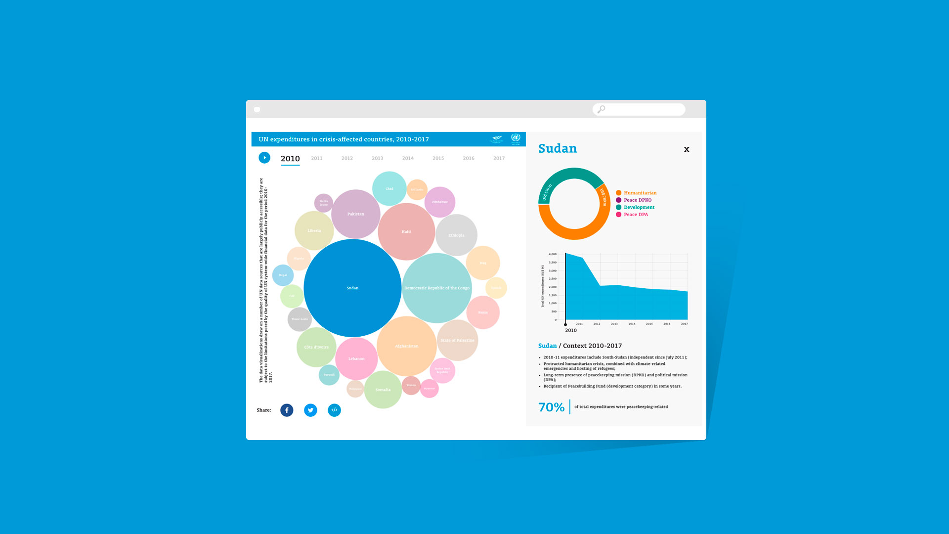
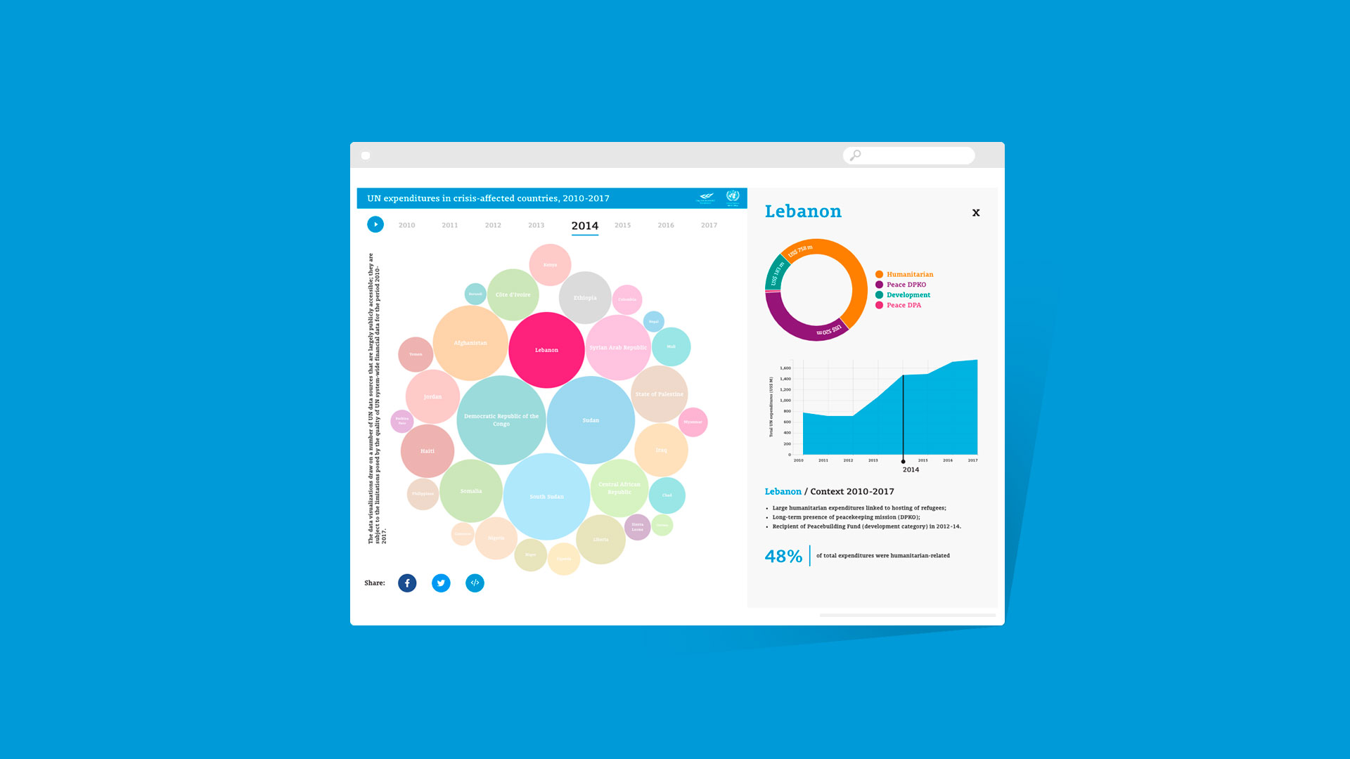
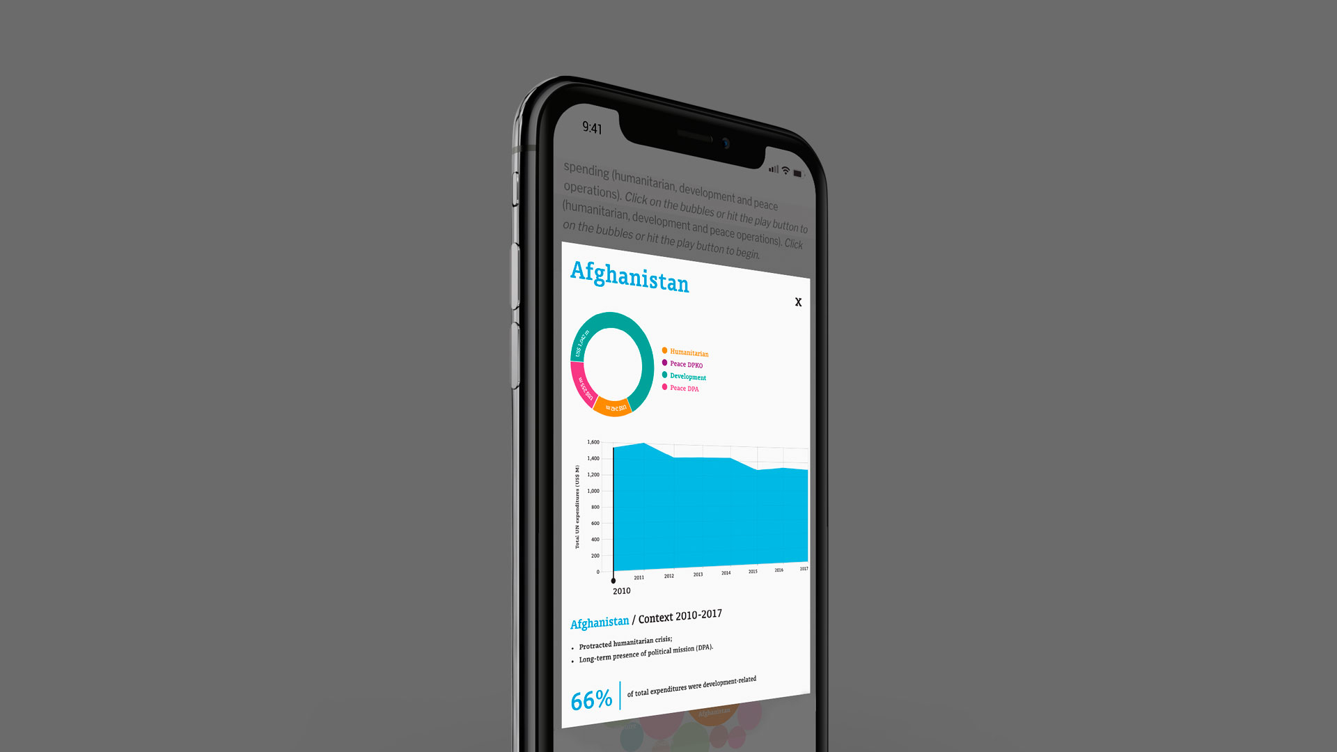
Visualization of UN expenditures

Visualization Concept

This project is a collaboration for the Elkanodata Agency.


The client, United Nations MPTF office, needed to explain UN expenditures, over ten-year periods, in various operations in the top countries affected by various humanitarian and development crisis.


For the first level of interaction, we chose a bubble chart that clearly shows how the expenditures are distributed over time by each country. Browsing by year, you see a clear difference in the size of the circles.

For the second level of interaction, we detailed in two charts the division of the expenditures, including both the year and country chosen, per operational activity (Humanitarian, Peace DPKO, Development, Peace DPA)

UN-MPTF-2bb
UN-MPTF-2aa
UN-MPTF-2c
VIEW
CLOSE